Turn Your Phone Photos Into Art
Hello! In this tutorial, we will learn how to combine illustrations with photographs and make them flow together into a beautiful piece. The intent is to show you how to use photos to speed up your process and seamlessly merge them with your style.
To make things fair for everyone, I am using the Trial version of Clip Studio Paint and the default tools only. Of course, you may find more assets on the Marketplace or create your own to suit your needs!
Choosing the Photograph
Before we begin, here are some tips for taking and choosing a good photo.
All the photos in this tutorial are made with a mobile phone camera. You don't need fancy, expensive cameras to do this!
- It is the best to pick a photo with neutral lighting, without strong shadows or highlights. This will make the image easier to manipulate, and add the shadows and highlights of your own choosing.
- Photos with big shapes and fewer small details will work the best, especially when going for a stylized look.
- ALWAYS make sure to use a photo you own the copyright to! If you do not have many photos of your own, slowly get into the habit of taking photos with your mobile phone and you will build a decent library in no time. Of course, it is not always possible to take a photograph of some things, so make sure you are using appropriate stock websites that allow free usage. Photos found on search engines or professional photographer websites are often under copyright to their respectful owners, so please be mindful of that!
- When taking a photo, a well-lit environment will make all the difference. Unless you are using professional equipment, photos made in the dark or poorly lit areas will often appear grainy, blurry, and shapeless. This will make them very difficult to work with.
- Avoid taking photos through an app with filters! While they may look nice on your phone screen, the filters will often degrade the photo quality, cause pixelated edges, and make it look noisy. Stick to the default camera app with the enhancements (sharpening, blurring...) turned OFF.
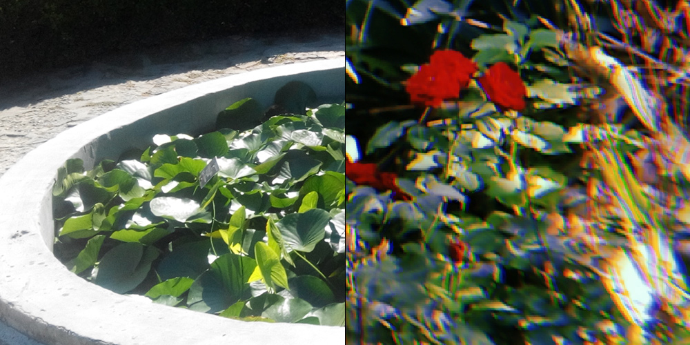
Left: Photo that is too high in exposure and contrast.
Right: Example of a phone app filter making the image pixelated and distorted.
Preparing the Photo for Illustration
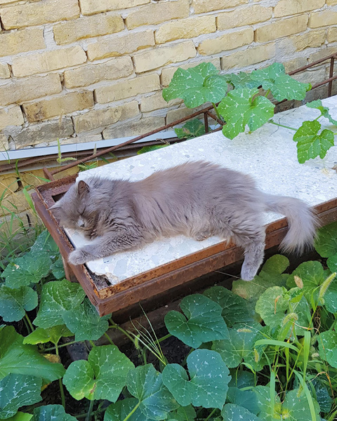
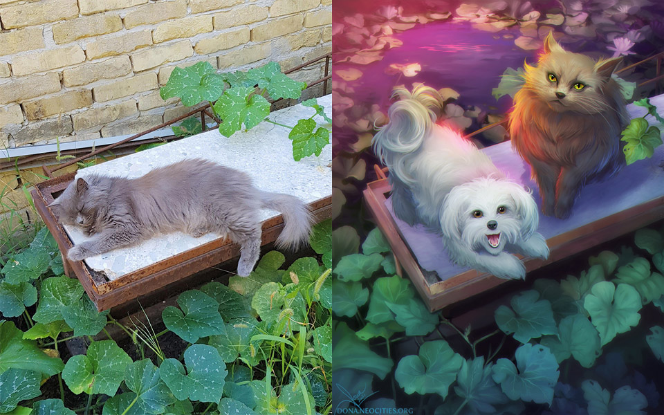
For this tutorial, I will be using an old photo of my parent's cat, Penny, in her favourite place among the pumpkins in the back yard. They recently got a dog (Zara!) and I would like to paint them together in that location. I like this photo because of the neutral contrast and the big, simple shapes that will allow me to add a lot of detail on my own and make the characters stand out.
Important: The photo should be there to support your original idea and make the piece stronger, and it should not be a crutch, but a helpful tool to help you present the idea.
First, prepare the photo(s) and work on the initial illustration composition. You may do sketches over the photo or add more assets and elements to aid your idea. If you come up with ideas that should be added in later steps, you can simply write them down on a piece of paper or a note app. It is a good idea to keep all of your reference photos in one folder or a free program like PureRef.
Taking the Selection Tool (M), cut out all of the areas you will need into layers and arrange them. The Lasso Tool is for freehand selection, while the Polyline Tool allows you to draw straight lines.
Tip: Hold Shift when you start a new selection if you would like to add it to the existing selection. Hold Alt to remove areas from the existing selection.
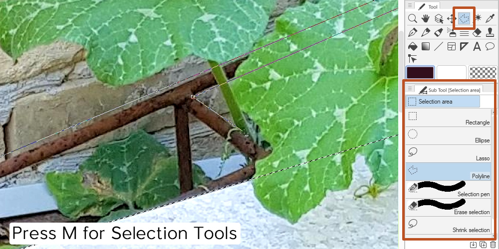
Here is my initial result: I did not like the brick wall and the metal pieces near it, so I cut it out completely and it will be replaced. The table is cut into a separate layer for easier editing afterwards, and I made sure to carefully cut out some leaves because I know I would like them to overlap a character later on.
I added another photo that will be the new background and clip it to the Wall layer. The lily pond photo was taken at the gorgeous seaside gardens in Balchik, Bulgaria, on a vacation a few years ago. Clipping a layer means that the layer it is clipped to defines the visible boundaries. Since I cut out the exact shape of the brick wall, the new background with the plants and the pond will show in its place.
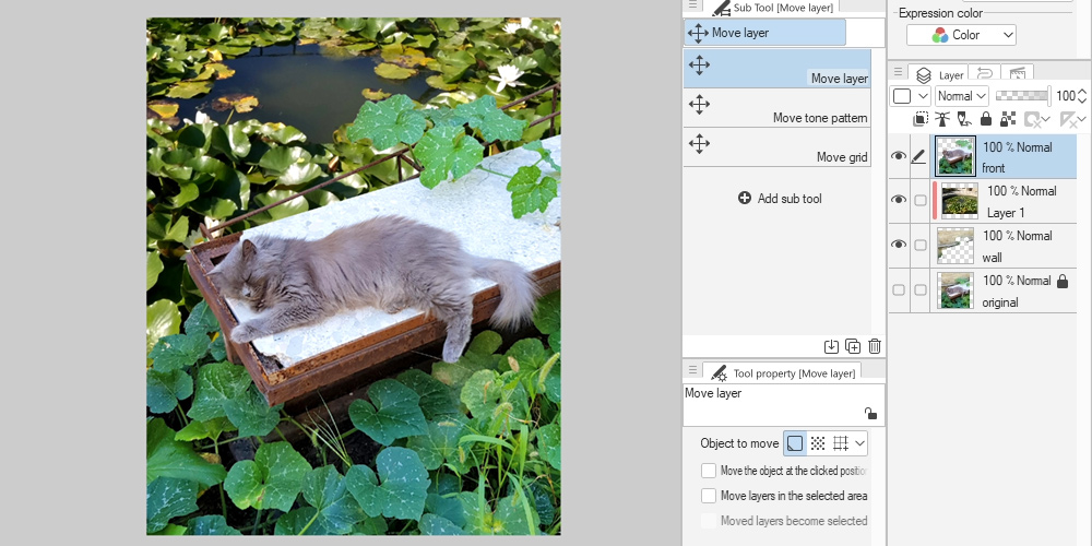
How to create a Clipping layer: Put your new layer right above the one you want to replace and click the button as shown. A red line will appear next to the clipped layer, and it will be clipped to the layer directly below it. You can clip as many layers as you like.
Stylizing the Photo
The next step would be to make everything work together. I like to start with adjusting Colour Balance (Ctrl + B) and Hue/Saturation/Luminosity (Ctrl + U).
Tip: All of the colour adjustment options can be found under Edit > Tonal Correction.
This is the perfect time to get creative and make all of the major adjustments that set the tone of your piece. Make it darker and colder for a night scene, shift to colours into unnatural tones for a beautiful fantasy piece, make it black and white if you are working on a comic in such style... the options are limitless!
I will keep mine simple for the sake of the tutorial. I liked the colour of the pumpkin leaves and the rusty table, so I made changes to the lily pond photo to match it. Then I turned some edges a more purple hue to add depth to the image.
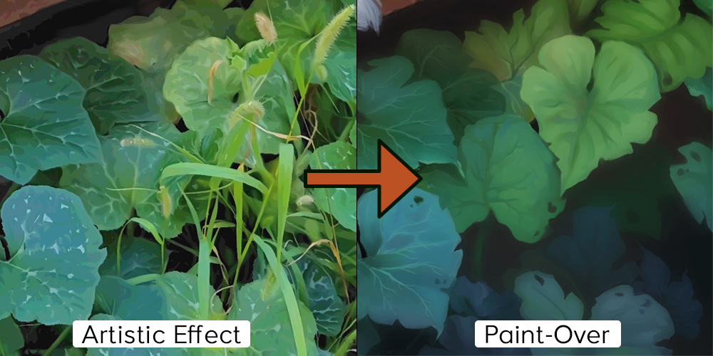
Now, the main tool that will help you with the illustration: the Artistic effect.
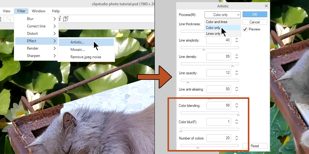
Go to Filter > Effect > Artistic. In the pop-up, select "Color only". Of course, you may play around with the other two options if they fit your style better. For illustration, I think the "Color only" option is the most useful.
Now play around with the last three settings. The results will be slightly different for each photo, so take your time to experiment and see what looks the best. I used a different setting for every layer.
Tip: What you want to strive for is easy to read shapes and a limited amount of colours you will be able to pick from. "Color blur" is best left at 0, because otherwise it may produce a muddy look. Keep it crisp and clean with well-defined shapes, because this will be the base for your painting.
Now that the image has been simplified, you may block out any unnecessary detail. I removed the sleeping cat from the table to make space for my own illustration. This was done by simply selecting the table with the Polyline tool and painting over with a brush.
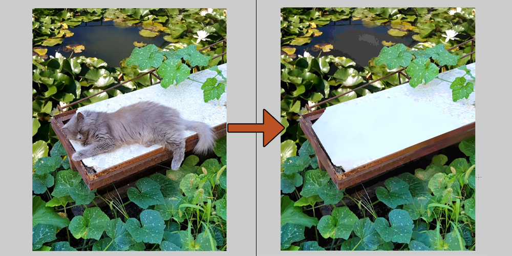
The difference in style may not look big when zoomed out, but it will make all the difference once you get to painting!
Adding Your Illustration
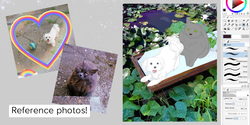
This is where your beautiful handiwork begins. I did a rough sketch of Penny and Zara using the Pencil Tool, then added some quick colour with the painterly Brushes.
At this point, use your normal painting process to add characters, plants, items, ornaments, and so on. I will not cover that part because this tutorial focuses on incorporating the photos with your own art, so let's see what else we can do about that!
Here are the painted characters. However, the photograph backgrounds stand out stylistically, even with the Artistic effect applied. It is missing a crucial touch: your own hand, heart, and style.
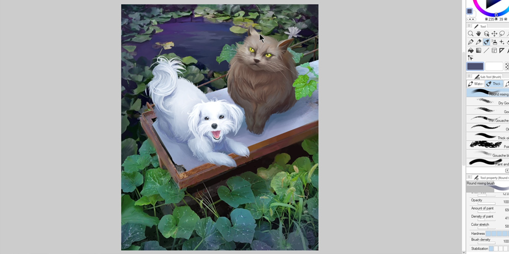
Tip: Colour-pick from the surrounding photographs and combine those colours with your illustration. This will help bring the whole picture together. For example, I picked colours from the surrounding leaves to colour in Penny's eyes. I also used some of the surrounding shadow colours for, well, shading the characters with a very light touch.
Painting Over the Photos
It is time to select your favourite painting tool and give those photos a face-lift. The Artistic Effect is great at simplifying the visual information and creating a good base for your painting, which will save you a lot of time. But you are the one who can take this a step further and mould the photo into your own style.
I recommend using either a Think Paint Brush (B) or a Blend Tool (J) to soften the colour transitions and get rid of the artifacts and stray lines. Hold Alt while the brush tool is selected to turn it into the Eye-Dropper Tool for quick colour picking.
In my photo, the grass and leaves made for a messy visual and there was too many messy lines. I painted over the grass, removed entire portions of it, and painted new leaves. It was also important to give a simpler shape to the leaves and re-draw the veins to be more in my style. Remove any unnecessary detail and add your own little flourishes. Really push the shadows and highlights for a better effect!
Finalizing
From here on, continue to paint as normal. Take your time cleaning up the photo details and don't be afraid to make big colour changes and add new elements. As I said in the beginning, the photograph is there to support your vision, not become the main attraction.
Here is the final result and comparison! You may notice that I added some soft light sources to better tie the whole illustration together.
Thank you for reading this tutorial and I hope you found it helpful! Let me know if you have any additional questions.
Happy creating!
Originally posted on the CSP TIPS website.