How to Make Emotes
Hello!
I will show you how I go about creating emotes (or any kind of small art). This tutorial is created in Adobe Photoshop. However, most of the techniques can be applied to any graphics program.
Ideas and Sketching
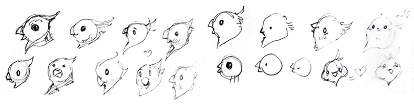
I start off with the general idea of what I want the emote to convey and then I get to sketching. You can sketch anywhere - traditional sketchbooks, napkins, tablets, computers, everything is fine! The point is to get creative and let the ideas flow. Draw anything that comes to your mind and do as few or as many sketches as you like. Lingering on the details is not necessary, that will come later.
I decided to draw a bird that is happy. As you can see, my initial ideas were a profile view, and then a few style exploration sketches. I settled on a front view because I think it would look better in chat.
Think about: Emotion, in what situations the emote would be used, the tone it conveys (serious, humorous, and so on). If you are creating an emote for someone else, you may discuss these points with them.
Setting up your file and workspace
First, set up document dimensions. Since I know the largest size my emote would be viewed at is 128x128px, I chose to double the size of the canvas - 256x256px. This means small mistakes will not be noticeable when the file is sized down, and it will be easier to put details in.
Next, set your background colour. You want this to be the colour of the website’s chat background. For example, on Twitch you can choose between Light and Dark mode, and Mixer has a distinct dark blue background. To make your emote look as best as it can, keep the background colour(s) in mind. I created layers filled with each background colour, which allows me to switch between them and see if my emote looks good on all of them.
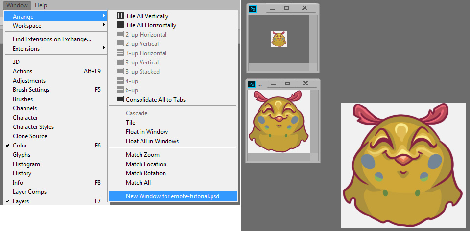
Now, we will use Photoshop’s “New Window” option, that allows you to display the same file in multiple independent windows. It is located in the menu: Window > Arrange > New Window for [your file name]. This option is extremely useful because now you can zoom out your new window and see what the emote will look like scaled down as you work on it! For a 256x256 canvas, the smallest version of the emote (28x28px) will be shown at 12.5% zoom. You may create as many window copies as you like - I made another one to show the biggest size of the final emote, at 50%. This is extremely helpful because you wil be able to tel if something looks off, or if a detail is so small it will not show properly, in which case you can simplify it or remove it.
Phew! Now that we have set our document up, we can get to work!
Drawing!
Start off with a sketch. Do it in any way that fits your style. For example, you may start off with a simple line sketch. Or you can start with shapes and colour. In any case, focus on readability (especially on the smallest version!) and eleminiate any excess detail.
In my first sketch, I had a frontal “hairstyle” and a heart that I removed in favour of ear-like feathers for simplicity.
Tip: use the “Flip Horizontal” option! This will help you get a fresh perspective on the drawing and identify mistakes early.
Next is the lineart. One challenge about creating artwork that is going to be viewed in multiple sizes is making sure the details stay readable and equally visible in all versions. I recommend keeping your lineart on a separate layer. Some programs, like Paint Tool SAI, allow you to change line thickness on finished lineart. The same is true for the Pen Tool in Photoshop. I use a normal round brush in Photoshop, set to 6px and weight varying on pen pressure, so changing the line weight will be a little more complicated. Experiment with different line weights - too thin and they will get lost when resized, too thick and they may look odd in bigger sizes (depending on your style).
Now we can add colour! I like to keep each element on a separate layer. This is especially useful if you plan on making colour variations of the emote, having the elements on separate layers will make them much easier and quicker to edit.
When the flat colours are done, it is time for shadows, highlights, and lastly, details. I find that emotes can benefit from a strong contrast, so don’t be afraid to go a little darker or lighter than you normally would.

Refining
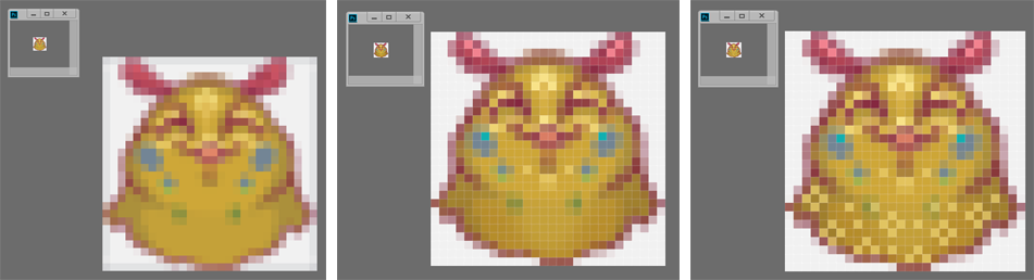
Almost done! But wait, there’s one more additional step that will ensure the quality of your emote: refining the small version. Now is the time to save a copy of your file and set the size to the smallest one (28x28px in my case). You can use the “New Window” option to view your picture at 100%, while zooming in and refining it on the canvas.
When you resize, some parts will get very fuzzy. I had a “halo” around my image, so I used the Lasso Tool to select those areas and delete them. For refinement on such small images, I use the Pencil Tool set to 1px. Clarify and smooth out the details, bring in more contrast and sharpen the image. This is often the most time-consuming part for me, but it is worth taking your time with it.
This is where having the lineart on a separate layer comes in handy: you can simply duplicate it, darken if necessary, and it’s going to look better.
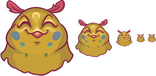
Once you are happy with your creation, get it ready for uploading. Don’t forget to hide the background layer when exporting!
Congratulations! Have fun with your new emote! :D
Interested in seeing more of my emote work? Head over here!